
How Can I Pick the Perfect Countertop Color for My Space?
Choosing a countertop color is one of the most important design decisions in a kitchen. Countertops take up a large portion of visual space, and the color sets the tone for the room. Whether you want something bright and airy or bold and dramatic, the right color affects how the entire kitchen feels. A well chosen countertop can make a small kitchen look bigger, highlight your cabinetry, or bring balance to a busy layout.
Because every kitchen has different lighting, cabinet colors, and flooring, selecting a countertop color is not always simple. What looks great in a showroom may look completely different in your home. Understanding how colors behave in various lighting conditions and how they interact with other materials helps narrow down your options. With a little planning, you can choose a countertop color that feels timeless and comfortable.
Quick answer: You can pick the perfect countertop color by considering your cabinet color, your kitchen’s lighting, the size of the space, and the style you want to create. Light colors open up smaller kitchens, darker shades add depth, and neutral tones work well with most design styles. Bringing samples home is the best way to make the final choice.
Understanding How Color Affects Your Kitchen
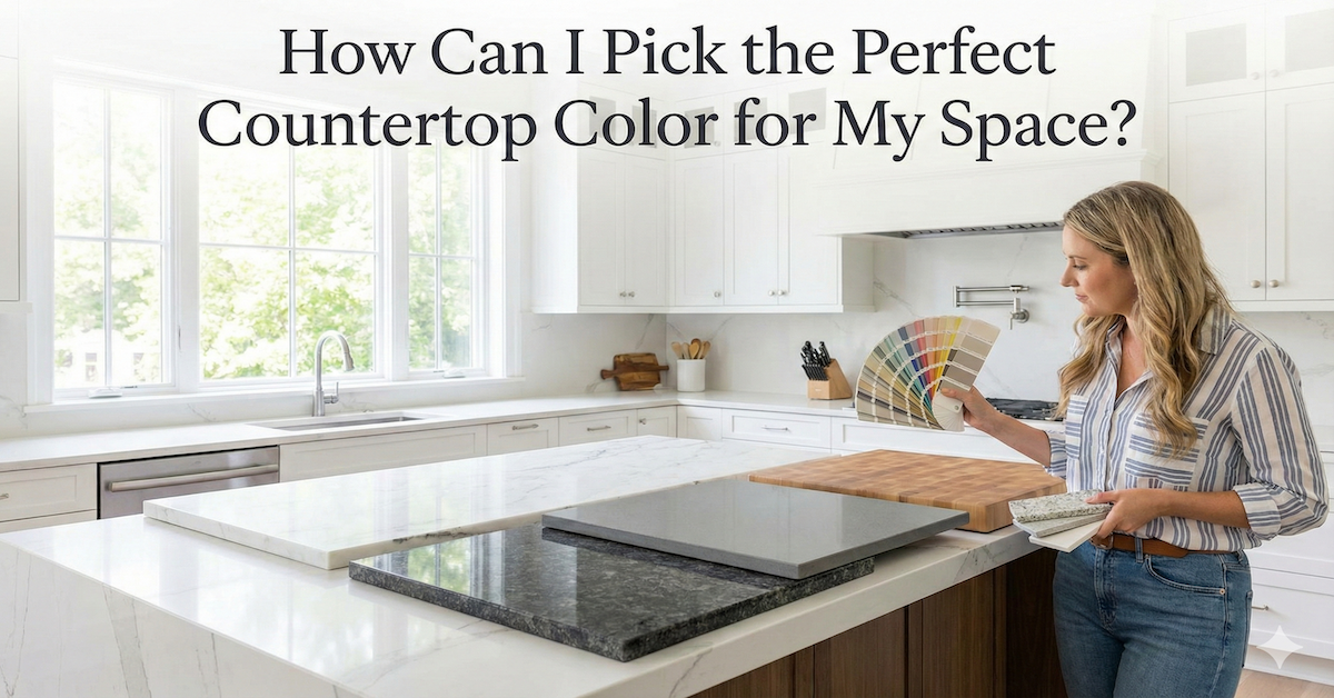
Countertop color has a strong influence on the mood and brightness of your kitchen. Light colors like white, off white, and pale gray make a room look larger by reflecting more light. They create a soft, clean appearance that works well in kitchens with limited natural light.
Darker colors like charcoal, espresso, or deep brown create contrast and richness. They can anchor a bright kitchen or complement darker cabinetry. Dark countertops also bring a sophisticated, dramatic feeling when paired with light cabinets or stainless steel appliances.
Midtone colors like warm taupe, beige, soft gray, or muted stone create balance. These shades work well when you want a natural look that feels inviting but not overly bold.
It helps to think about how you want the space to feel. A bright, open kitchen may call for lighter countertops, while a warm and cozy design may benefit from deeper tones.
Matching Countertop Colors to Your Cabinets
Your cabinet color plays a major role in choosing the right countertop. If you have white cabinets, you can pair almost any color with them. Light countertops create a uniform look, while darker tones offer contrast that adds depth.
Wood cabinets work best with countertop colors that complement the undertones of the wood. Warm toned woods pair nicely with cream, tan, or warm gray. Cooler toned woods, such as light oak or ash, pair well with soft gray or muted white.
Painted cabinets offer even more flexibility. Navy, green, and charcoal cabinets look polished with light countertops. Softer colors like sage, taupe, or ivory can pair well with both light and dark stones.
When matching cabinets and countertops, choosing tones that either complement or intentionally contrast creates a balanced, cohesive look.
Evaluating How Lighting Changes Countertop Colors
Lighting is one of the most overlooked parts of choosing a countertop color. Natural light brings out the true color of a surface, while artificial lighting can change the tone completely. Warm lighting can make cool toned countertops appear yellow, and cool lighting can make warm toned countertops look flat.
If your kitchen has limited windows, darker countertops may appear even darker during certain times of day. Lighter surfaces brighten the space and prevent it from feeling closed in. In a kitchen with abundant natural light, darker countertops often look striking without overwhelming the room.
The best approach is to bring countertop samples into your home and view them during morning, afternoon, and evening lighting. This ensures you choose a color that stays beautiful throughout the day.
Choosing Patterns and Movement in Countertop Designs
Beyond color, the pattern and movement in a countertop can change the feel of your kitchen. Some materials feature soft, subtle veining that adds elegance without drawing attention. Others have bold marbling or speckling that becomes a focal point.
If your cabinets or backsplash already have strong patterns, a simple, consistent countertop pattern helps balance the room. If your kitchen is mostly neutral or minimal, a countertop with striking veining can add personality.
Quartz, granite, marble, and other materials each offer different types of patterns. Quartz often provides consistent, predictable designs, while granite features natural variation. Consider how bold or subtle you want your countertops to appear before deciding.
How Lifestyle Influences Your Countertop Color Choice
Your daily habits should play a role in selecting a countertop color. Lighter colors sometimes show stains or spills more quickly. Darker colors may show dust or water spots. Busy patterns hide crumbs and marks easily, while solid colors reveal more imperfections.
Families with active kitchens may prefer designs that hide minor messes as they cook throughout the day. Homeowners who want a clean, minimalist look may prefer smooth, solid colors even if they require a bit more upkeep.
Choosing a color that aligns with your lifestyle ensures your kitchen remains both beautiful and practical.
Conclusion
Picking the perfect countertop color becomes much easier once you understand how color, lighting, and materials influence your space. By comparing samples at home, looking at how they pair with your cabinets, and thinking about how you use your kitchen daily, you can select a countertop that enhances both style and function. The right color will bring harmony to your kitchen and support the design you envision.
If you need help choosing countertops that match your cabinetry and complement your home, Kitchen Discounters can guide you through every option. Our team can help you explore styles, compare materials, and find the perfect countertop color for your space.